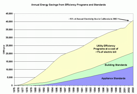
So, the above picture is the famous Rosenfeld Curve, showing that Energy Efficiency programs in California are a success. I agree they are a success, but the purpose of this post is to ask, what is the reference for the graph? Who created it? When was it first published? What are the underlying calculations? Does this include gas savings that are then converted to GWH equivalents? Is there a breakdown by utility or city or sector (residential vs commercial?) Are these explained somewhere on some sheet of paper that permits outside review?
So far, this is the best answer I’ve found:
Goto http://www.energy.ca.gov/2007publications/CEC-200-2007-015/CEC-200-2007-015-SF2.PDF
How is this calculated? This part is clearer. A DOE-2 building simulation model and other energy forecasting models are run under scenarios with and without different conservation programs and modeling assumptions. These are (removed?) in reverse order, and the difference in model simulations between simulations runs is the impact of the incrementally removed programs.
As an example,
MODEL RUN A = Appliance standards + Building Standards
MODEL RUN B = Appliance standards
GWH_FROM_A – GWH_FROM_B = savings from Building Standards.
One uncertainty remains regarding the “Utility Efficiency Programs” part of the graph. This is not part of the afore mentioned Table 6, so I’m guessing these are reported values from the utilities themselves (???). The current post-2004 (maybe 2003?) RRIM (Risk Reward Incentive Mechanism) does do extensive measurement and verification (but very little ex post MEASUREMENT, I might add), I had previously thought that claimed DSM (Demand Side Management) savings were not reviewed. This is not true, exactly. The pre-RRIM program had audits, but these were done by the Utilities themselves or by third-parties that were hired by the Utilities. Now, with RRIM, verification is done by a third party selected by the CPUC (I think?) But I digress. Here, I mention it because I do not know where the “Utility Efficiency Programs” numbers come from. In contrast to the other measures, these numbers may not come from a simulation, but from reported values.
Also, in the same document there is another graph that looks similar to the above Rosenfeld Graph. These are Figures 9 and 10 from http://www.energy.ca.gov/2007publications/CEC-200-2007-015/CEC-200-2007-015-SF2.PDF.
But, eyeballing the 2003 number (and here they do list “Utility and Agency Programs”), the residential number is about 15000GWH and the commercial number is about 10000GWH, for a combined savings of 25000GWH. This is different from the 41000GWH that is claimed on the above Rosenfeld Curve graph.
I received a great response from the CEC, which included a document from 1995 titled “SAVINGS AND COSTS OF STATEWIDE EFFICIENCY STANDARDS” (available upon request). This was written in 1995, but includes a projection from 1975 to 2013. The GWH projected to be saved in 2003 was listed as 8495GWH, but this is due to just Building Standards and Appliance Standards.
So, this strikes out in meeting the $40 challenge (see below), but does give me more insight (another data point) into how the estimate is calculated.
Anyone able to give me a good answer gets the reward of dinner with me and my eternal gratitude or $40 cash. A good answer needs at least have a sheet of paper (from a report) that shows ~41000 GWH in 2003, or alternatively 36000 GWH in 2000 and describes somewhat the basis of the calculation. It should also be as early a reference as possible. This offer valid until I remove it from this wordpress page.
(funny: get the joke about the title, where ART thou??)
[…] This post is related to my criticism of the claim that energy efficiency is driving the CA vs USA wedge. See for one part of the discussion: https://opensourceeconomics.wordpress.com/2009/02/25/rosenfeld-where-art-thou-rosenfeld/ […]
Pingback by Heavy variation in heating fuel — implications for electricity use analysis « Economics should be open — May 21, 2009 @ 6:56 pm